CASE STUDY
Card Linking Flow
SUMMARYBy linking a credit or debit card to Rakuten, members can earn Cash Back at local stores and restaurants via card-linked offers. We updated the legacy card-linking form to match the design system, but a survey showed trust signals were down after the new design launched, even though we added security-focused messaging.
Impact
Decreased card-linking abandonment due to trust concerns from 31% to 17%
+12.8% CTR on card-linking entry point
The Problem
Rakuten wants members to link a card to their account to unlock in-store and dining Cash Back. Members who engage with Rakuten’s dining program have a higher LTV (1.6x non-dining members). However, the dining program is hidden compared to Rakuten’s online Cash Back offering, and the mechanics can be difficult to explain. There was also a lot of legacy screens that hadn’t been updated, leading to a fragmented experience. We needed to rebuild trust through strategic design and content updates at key points in the member journey.
My Role
I led content design across all touchpoints for Rakuten Dining, including entrypoints, the card linking form and the confirmation toast. I also suggested, created, launched and analyzed the Sprig survey for card-linking abandonment to understand why members began the process but ultimately didn’t link.
My Process
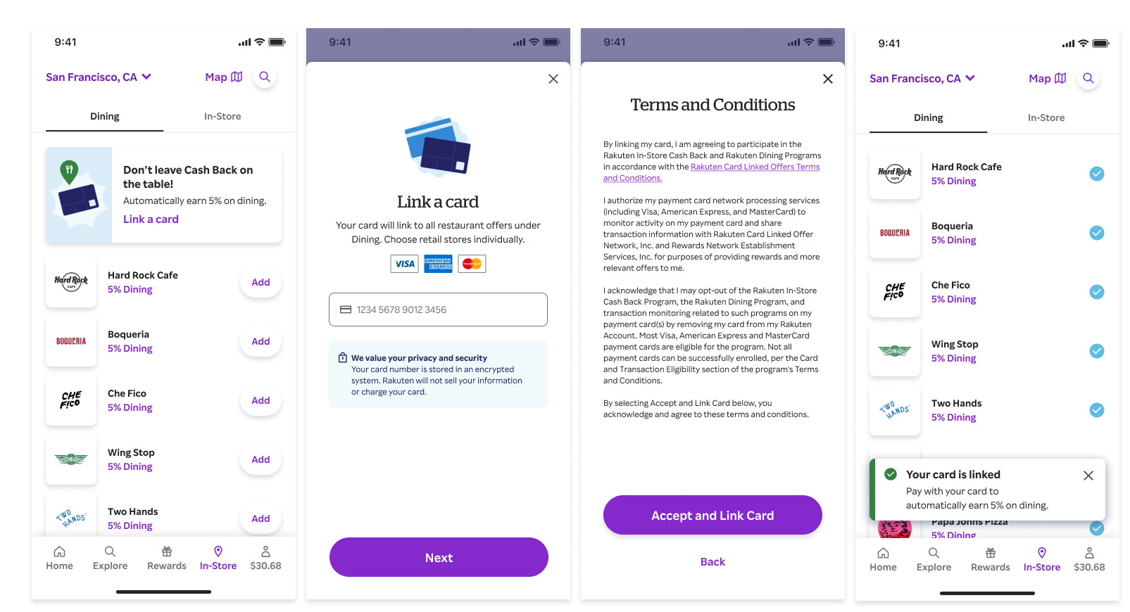
In late 2025, we updated the legacy card linking form to match Rakuten’s design system. I refreshed the messaging, adding security reassurance after hearing from members in past user testing.
1
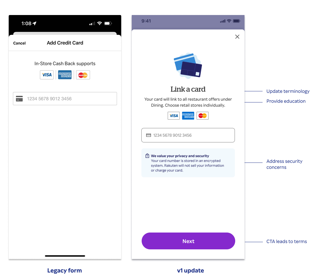
Key decisions:
Updated terminology to link a card / add offers
Provide education on how in-store and dining works, and what happens next
Worked with legal and compliance to create security-focused messaging
Improved the terms experience by placing them on a separate page vs the legacy modal
2
I suggested we add a form abandonment survey before and after launch to better understand why members began the process but ultimately didn’t link. I wrote the survey questions and responses, programmed it in Sprig and analyzed the data sets for the old form vs new form.
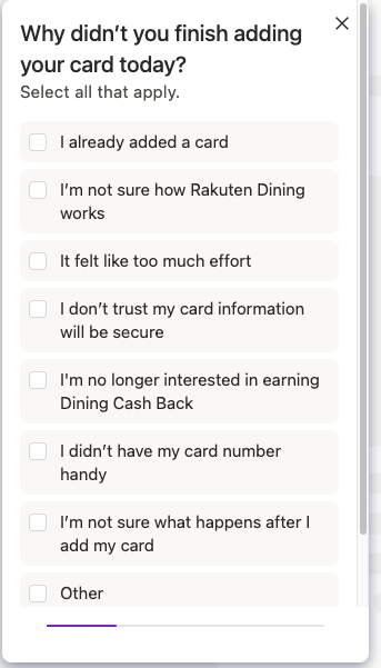
Survey results:
The new form improved both obvious UX problems and visual continuity between the card-linking flow and the rest of Rakuten, but the data suggested that trust concerns actually increased after the redesign, despite adding security messaging to the form.
In the legacy form, the top reasons for abandonment were around education.
In the new form, “I don’t trust my card information will be secure” jumped from 23% to 30% of responses.
My hypothesis:
Rakuten’s visual identity is whimsical and fun, which reads as less trustworthy to members. In serious moments like card-linking, we needed to tone down the personality in favor of a more utilitarian experience.
3
How do you build trust in high-stakes moments? To answer this, I collaborated with UXR to perform desk research on how best-in-class fintech platforms build trust while maintaining compliance.
Key takeaways:
Best-in-class experiences build trust through:
Clear purpose (why the card is needed)
“To verify eligible purchases”
“To issue rewards automatically.”
Explicit reassurance (what the company will not do)
“Will not charge your card”
“Will not sell your data”
Minimal data collection
One or two concrete security cues
Progressive disclosure (not information overload)
Recommendations for the card-linking form:
Explain the purpose; members should immediately understand why the card is needed
Strengthen negative assurances by making “we will not…” statement more explicit and prominent
Highlight data minimization, that we do not ask for CVV & expiration date
Add progressive disclosure to avoid info overload add easy clickable explanations
4
I also looked at how competitors handle their forms to identify patterns.
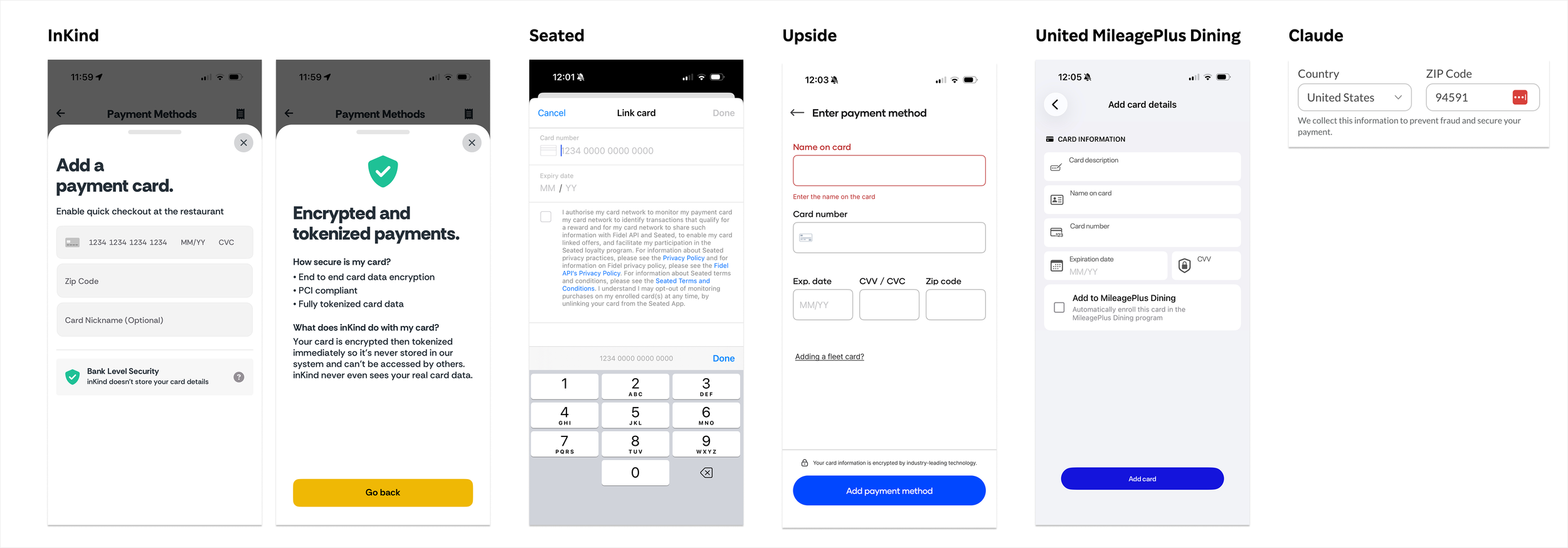
The competitive examples demonstrated many of the best practices from desk research:
Value-driven messaging (why you should link a card)
How data is and isn’t used
Progressive disclosure with ability to tap and learn more about security specifics (InKind example)
What really stood out to me was how all of the forms looked generally the same, and how that predictability reinforces trust. No one is using this as an illustrative branding moment.
5
Next up: Design and content explorations.
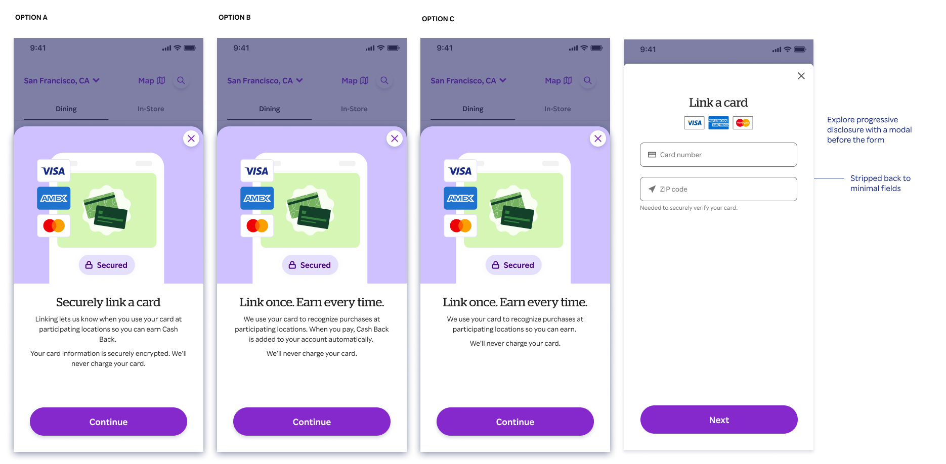
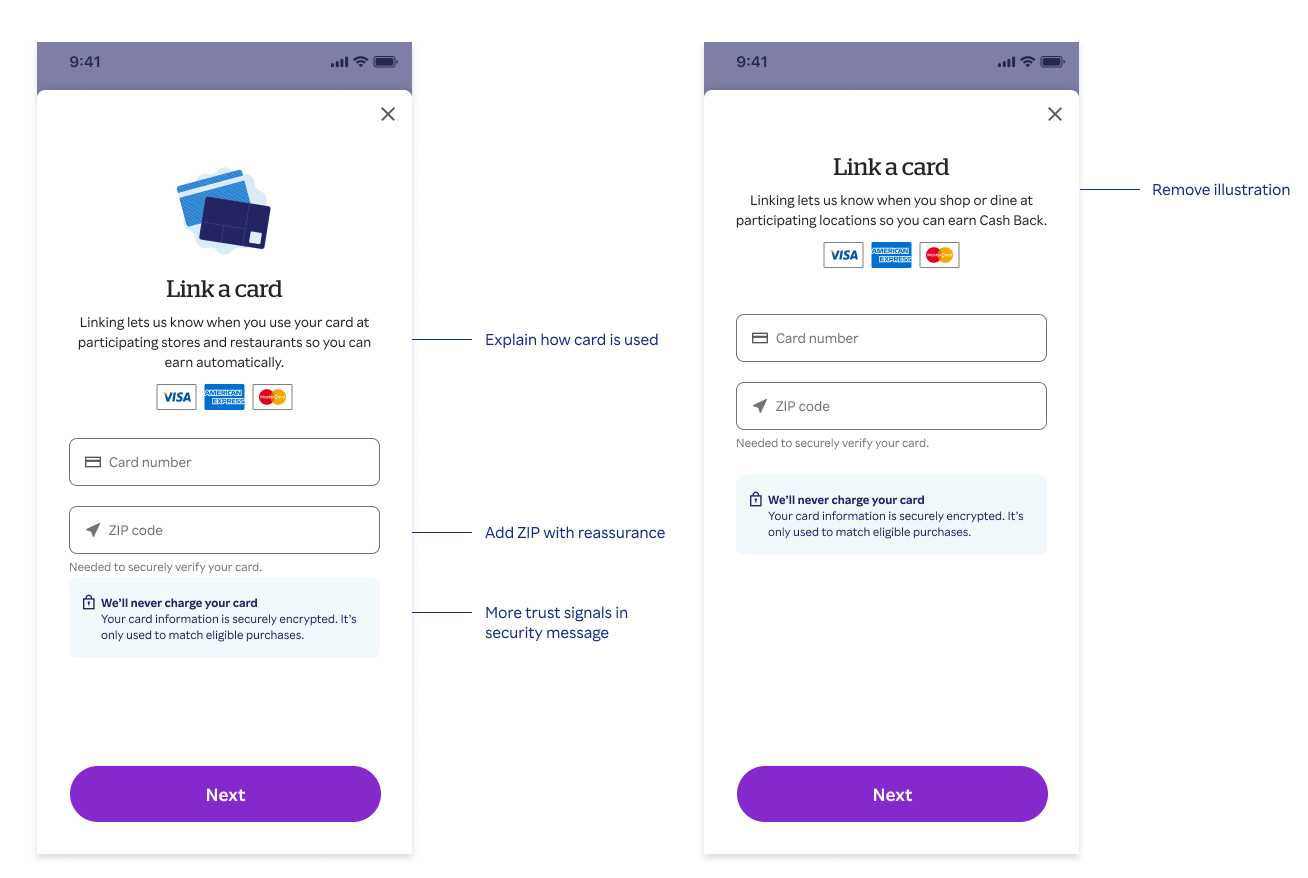
I worked with legal and compliance to craft the new trust-focused messaging, balancing best practices from the desk research with compliant security claims.
Solution
Card-linking flow before (v1)
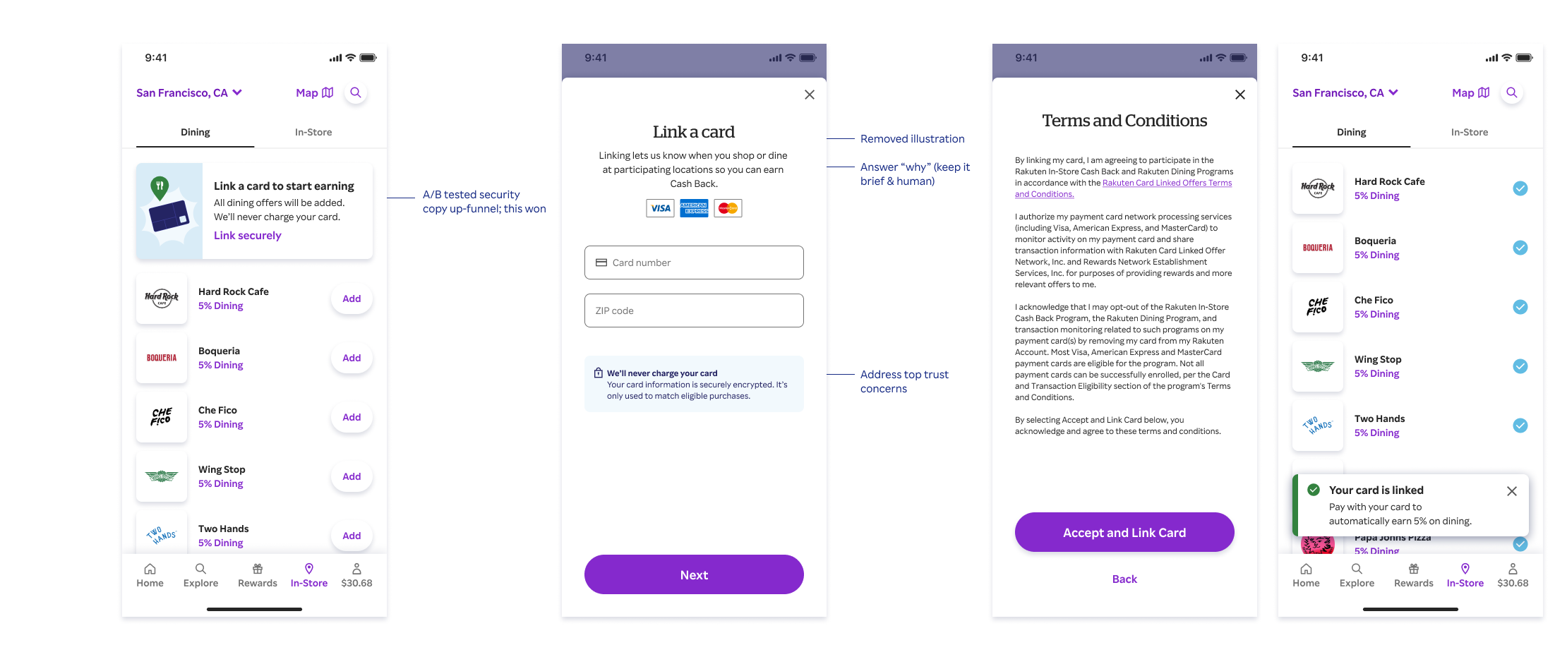
Card-linking flow after (v2)
Impact
31% → 17%
Rakuten members citing trust/security concerns as a reason for abandoning the form
~45%
Relative reduction in trust/security-related abandonment
+12.8%
CTR lift from experiment on card-linking banner entrypoint after security messaging was added
And a nice shoutout from research: